Plotting
We offer user-friendly plotting methods that make use of Plotly, Matplotlib, and Wordcloud to display useful graphs to give you quick insights on the downloaded data.
As an example, we are going to download at most 2000 tweets in english with the words 'bike commuting' between the years 2019 and 2021. For this, we use the following code snippet:
from gtdownloader import TweetDownloader
gtd = TweetDownloader(credentials='twitter_keys.yaml')
gtd.get_tweets(
query='bike commuting',
lang='en',
start_time='01/01/2019',
end_time='12/31/2021',
max_tweets=2000
)
Static visualization
After downloading the tweets, you can quickly preview the centroids of the tweets by calling the preview_tweet_locations() method:
gtd.preview_tweet_locations()

Interactive maps
The interactive map displays a map in which tweet data such as text and location are displayed upon hovering. Panning, zooming in and out, and snap shot saving are available in the animation.
gtd.interactive_map()
The aggregated version of the interactive map groups the tweets by location and displays bubbles in which bubble size depends on amount of tweets at the given location
gtd.interactive_map_agg()
You can chose a time_unit (year, month, day, hour, minute, or second) to use as time unit in a map-based animation of the tweets.
gtd.map_animation(time_unit='month')
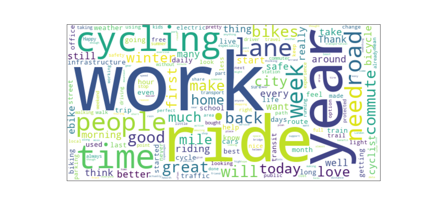
Wordcloud
Notice we make use of the custom_stopwords parameter to exclude the query words and the http and https tags that may arise from url posting.
gtd.wordcloud(custom_stopwords=['bike', 'commuting', 'http', 'https'], background_color='white')